
Some of these styles live in the building and some live in what you can carry out the door, and that split decides your look before taste does.
Renters can build on furniture, fabric and paint alone, and styles like Cottagecore, Shabby Chic and Farmhouse lean on exactly those 3 things. Owners can also work with structure: exposed brick, wood beams and stone walls.
1. Contemporary Design
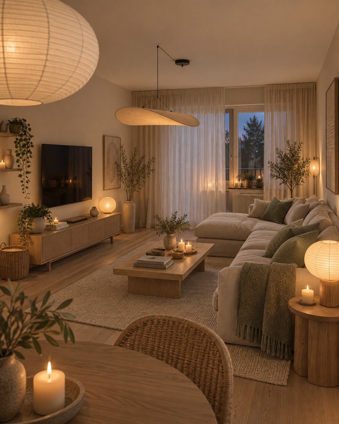
Contemporary design follows the present, so it keeps shifting, and that shapes how I’d buy for it.
Spend on the big, quiet pieces, like a light sectional in a neutral tone.
Keep the trend-driven items cheap and easy to swap: lanterns, pillows, candles, plants. When a look fades, you replace a few small things instead of the whole room.
Warm lighting keeps a neutral palette from feeling flat, so give it as much thought as the furniture.
2. Classic Design
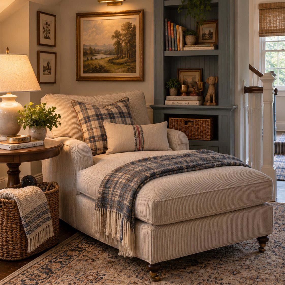
Balance does most of the work in a classic room. A striped chaise and plaid pillows read as a set because the patterns share a calm color range.
Keep the pattern count modest, and let a lamp on a side table anchor one end of the seat.
Built-in shelves give books and art a frame, and the symmetry looks intentional. Choose pieces you’d still want later; that’s what makes the look timeless.
3. Bohemian Design
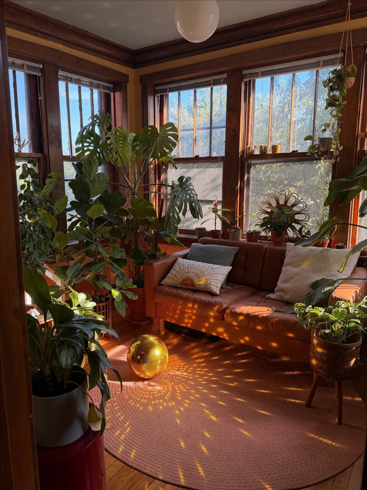
Bohemian rooms get built slowly, and I’d keep it that way.
Mixed influences read as deliberate when a color repeats. Warm brown, terracotta and gold sit in one family, so nothing fights.
Skip the matching set. It works against the whole idea.
4. Coastal Design
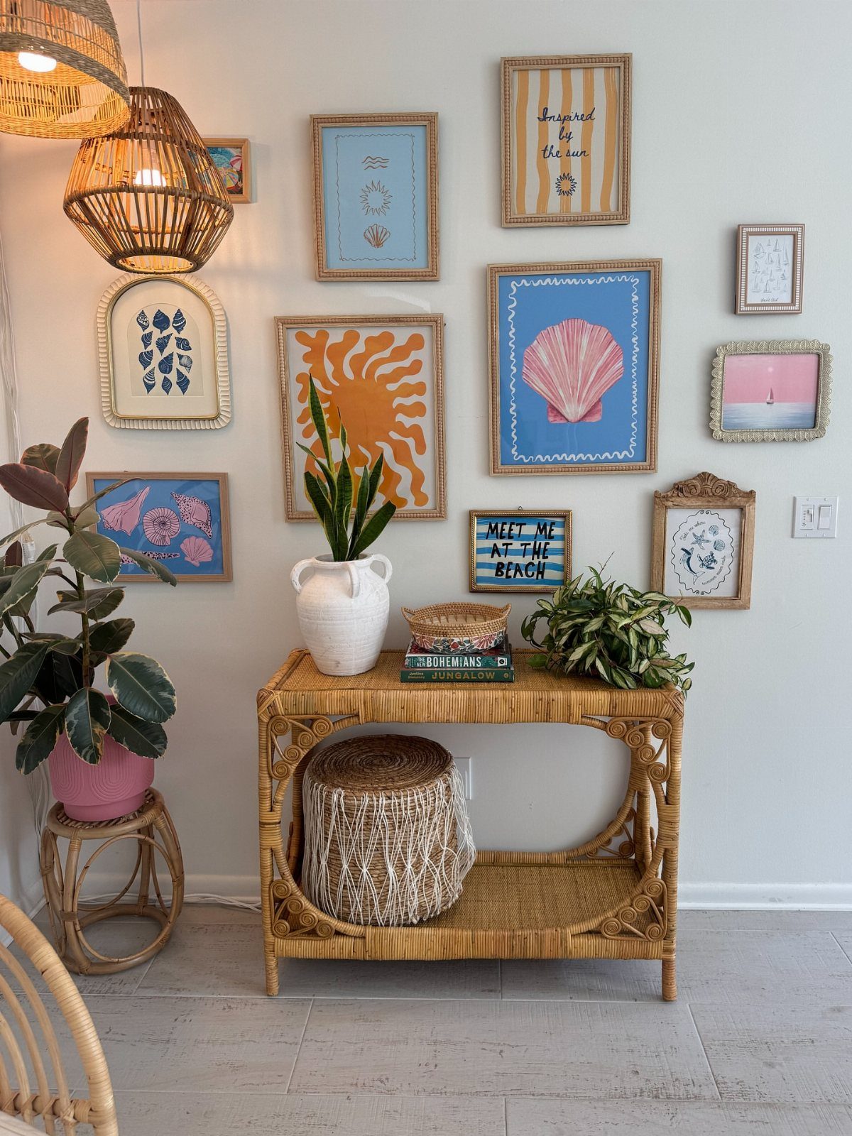
Sea, sand and sky give coastal design a short palette: soft sand tones, pale blues, white. Rattan and woven pendant lights add texture, so the room doesn’t turn into a blue-and-white theme.
Keep the frames simple and let the artwork carry the mood.
Style the console with a plant, a few books and a basket, then leave open space around them so each piece reads clearly. The airy feel comes from restraint.
5. Transitional Design
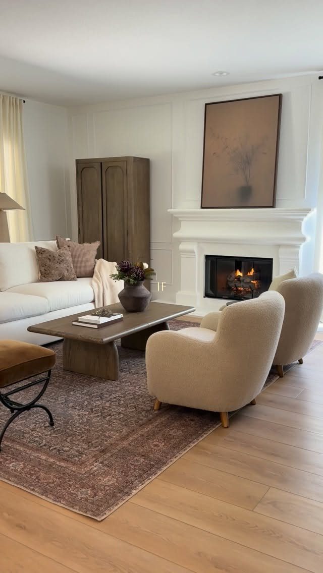
A fireplace is the traditional half of transitional design, already built in. Around it, I’d choose clean-lined seating: a white sofa and 2 cream armchairs keep the room calm.
Then add one pattern, such as a brown patterned rug, and one large piece of art.
I’d stop at that single bold move per room. Add more and the space tips toward one style instead of blending two.
6. Rustic Design
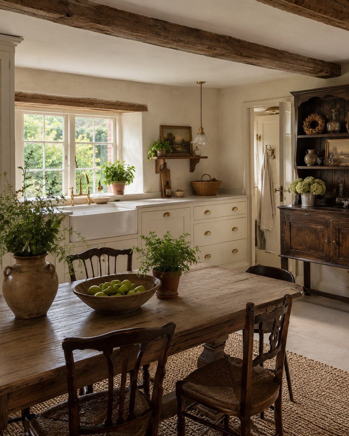
Rustic style is casual and rugged, built on natural materials that show character. A large wooden table is the right anchor, and I’d leave its worn surface alone instead of refinishing it.
Exposed beams and a dark wood hutch add depth, and a farmhouse sink suits the same relaxed mood. Potted plants bring in green.
If you rent and can’t touch beams or sinks, put the weight on the table and hutch, since furniture is the part you can buy.
7. Minimalist Design
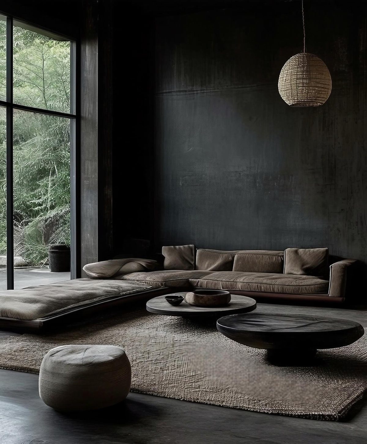
Minimalist rooms depend on what you leave out, and a dark palette makes that choice more visible.
Wood and a woven pendant keep the dark tones from feeling cold. I’d leave the window bare and let the greenery outside act as the art.
If a surface stays empty, that’s intentional.
8. Farmhouse Design
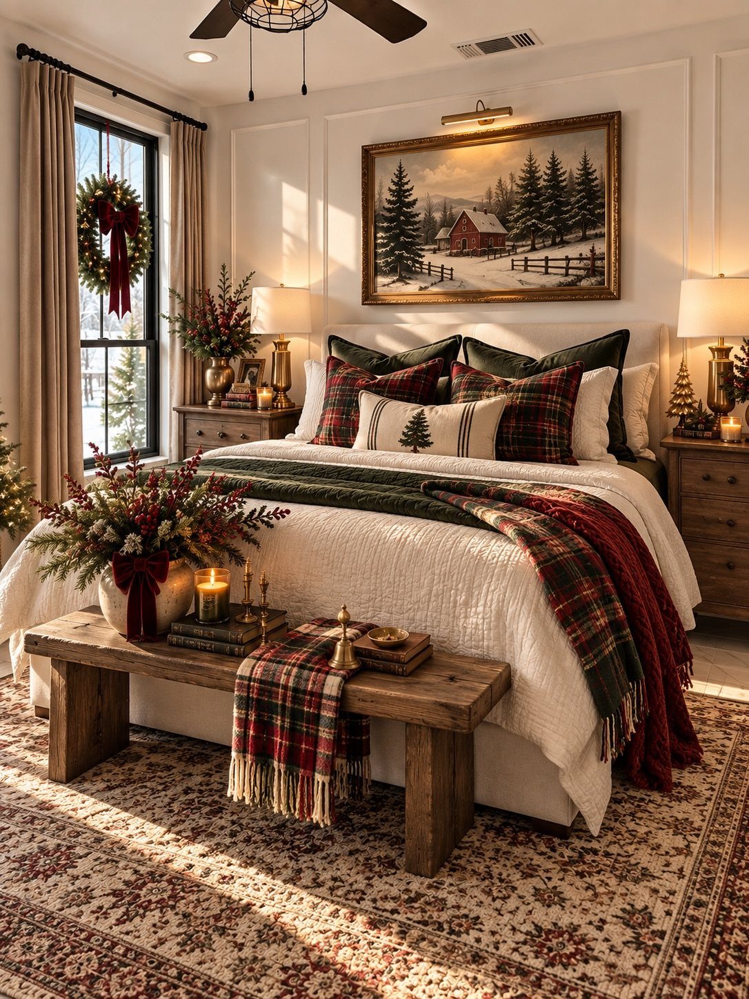
Patina is what separates farmhouse from a showroom, so a worn wooden bench at the foot of the bed does more than a new one painted to look old.
Solid wood, especially antique, carries nicks and a softened finish you can’t fake quickly.
Buy secondhand when you can; I’d pick one honest old piece over three distressed reproductions.
The holiday decorations are a seasonal extra. The room holds up without them.
9. Scandinavian Design
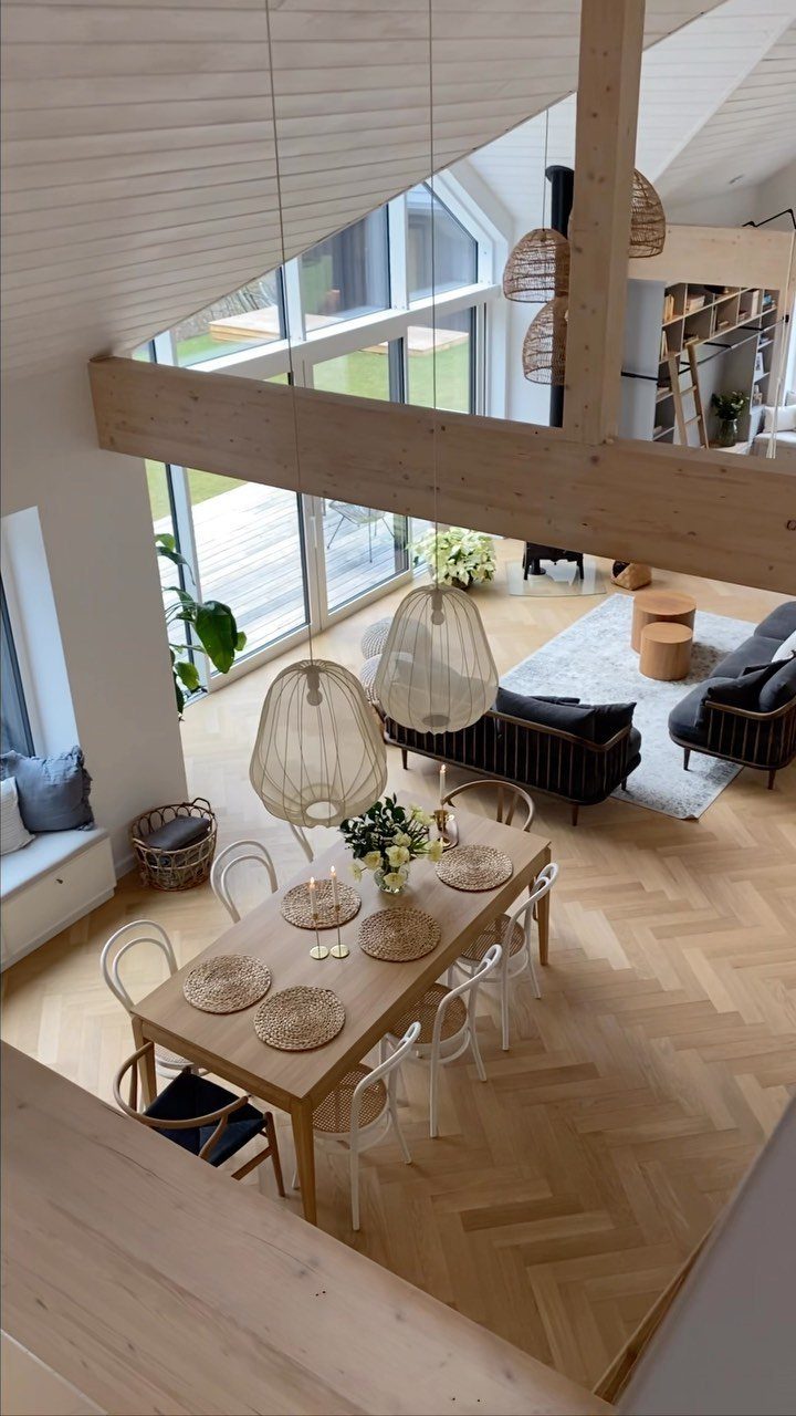
Light wood floors do the heavy lifting in a Scandinavian room. Herringbone adds pattern without any color, so the rest can stay neutral and quiet.
Pair the floor with a wooden dining table and white chairs, and let large windows supply the brightness. Woven pendants over the table bring softness and texture, and they cost far less than a statement chandelier.
I’d keep furniture plain and functional, with each piece earning its spot. In an open layout like this, repeating the same wood tone from dining area to living area ties the zones together.
10. Eclectic Design
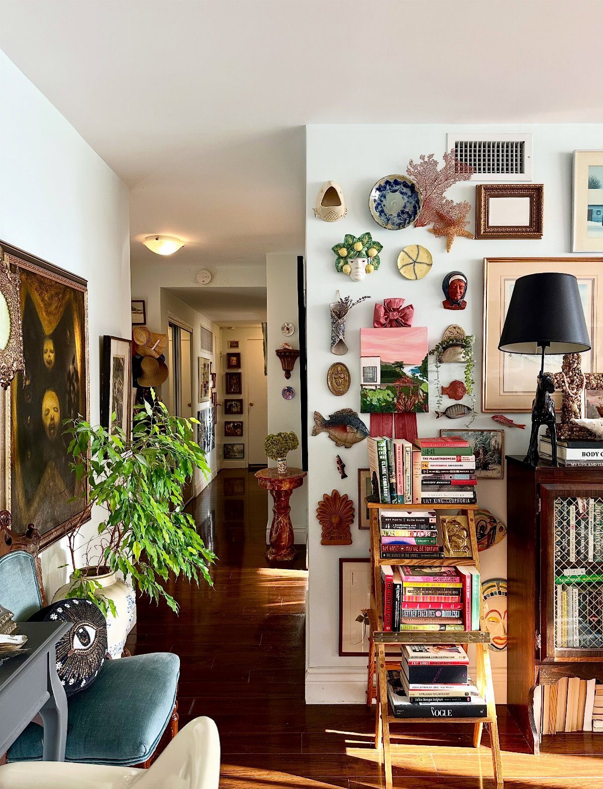
Eclectic only works when something repeats. A gallery wall of mixed art feels collected instead of random if the frames share a finish or the pictures share a color.
Start with one large painting as the anchor, then build smaller pieces around it. A tiered bookshelf, a houseplant and a lamp fill the nearby floor and surfaces, and each one adds a different height.
Hang the layout on the floor first, so you can rearrange before you put a single nail in the wall. That’s worth doing in a rental, where every hole counts.
11. Cottagecore Design
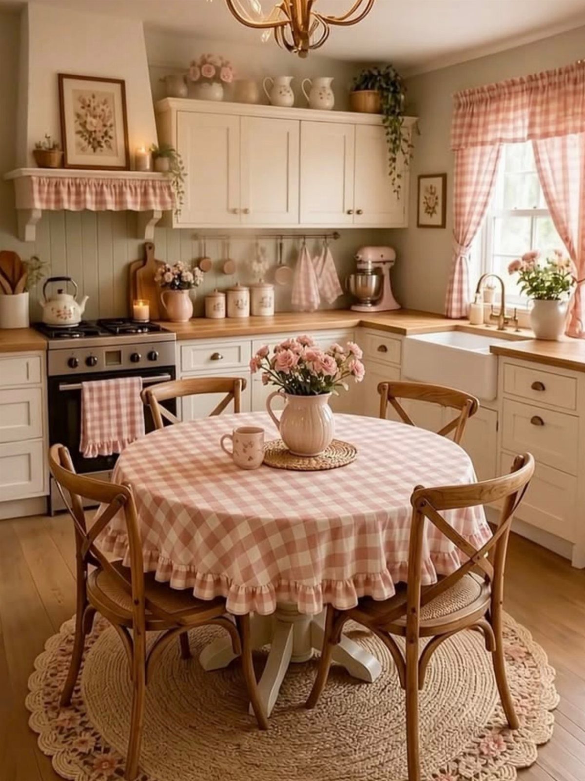
Pink gingham is the quickest way into cottagecore, and a tablecloth is the cheapest place to use it. Swap it out and the kitchen changes character without touching a cabinet.
I’d stick to one gingham color so the pattern stays sweet instead of busy.
12. Japandi Design
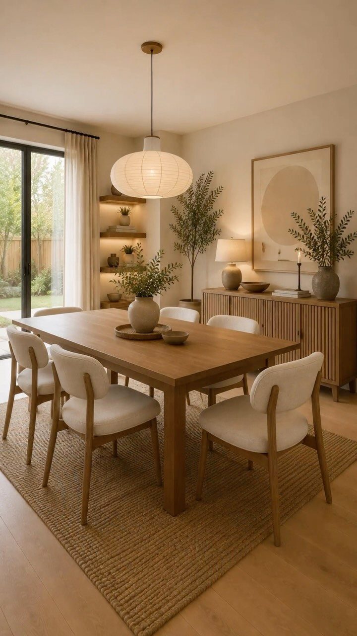
Japandi sits where Japanese restraint meets Scandinavian warmth, and a dining room shows the mix clearly. Pair a wooden table with light-colored chairs and a jute rug to keep the room natural and low-contrast.
The large paper pendant is the piece I’d splurge on, since it gives soft light and a sculptural shape without adding clutter overhead.
Choose texture over color here. Wood grain, jute and paper provide all the interest the room needs.
13. Art Nouveau Design
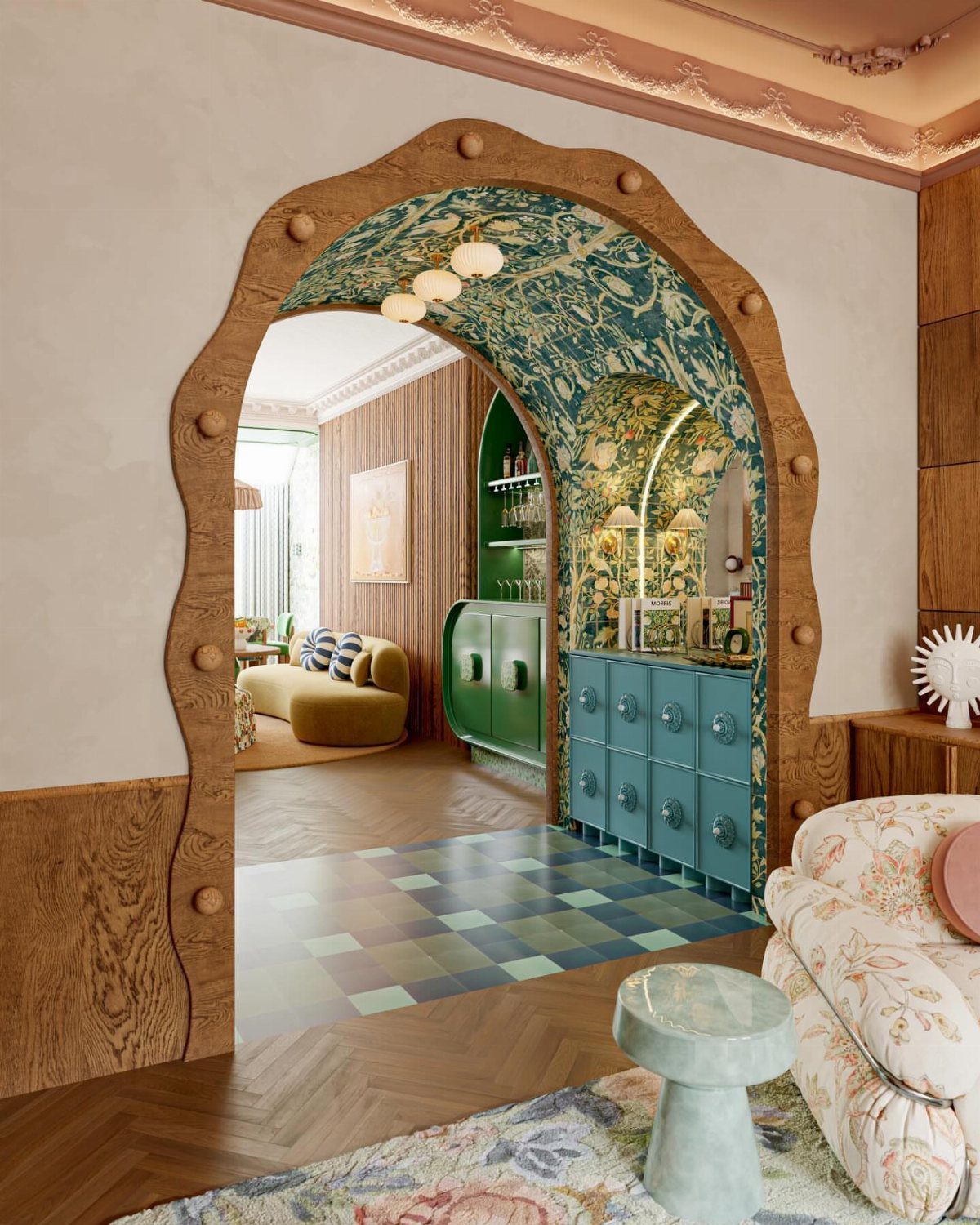
Art Nouveau is easiest to read in its curves. A rounded wooden archway softens a doorway the way a straight frame never will, and organic wallpaper carries the nature theme across a whole wall.
Echoing one shade in 2–3 places, say a pillow, a vase and a picture frame, makes the room look planned instead of collected. Teal and green furniture against a patterned tile floor holds together because the shades sit close.
Pick one curved feature to lead, either the arch or the wallpaper, and keep the other pieces plain.
14. Arts and Crafts
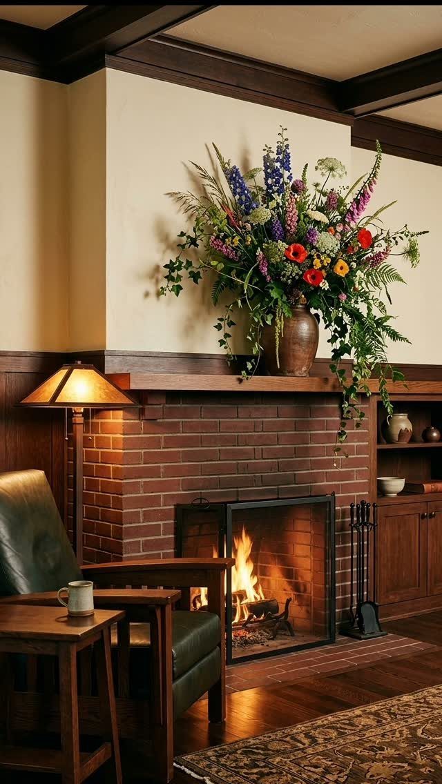
Arts and Crafts puts the maker first, so a dark wood chair with a visible build beats a polished piece from a catalog. Function drives the shape, and a brick fireplace gives the room a solid center.
A big arrangement of colorful flowers on the mantel is the cheapest way to bring in color. Swap the blooms with the season and nothing else has to change.
Let the rug carry the pattern and keep the furniture plain, like a simple wood side table with enough clear surface for a mug.
15. Industrial Design
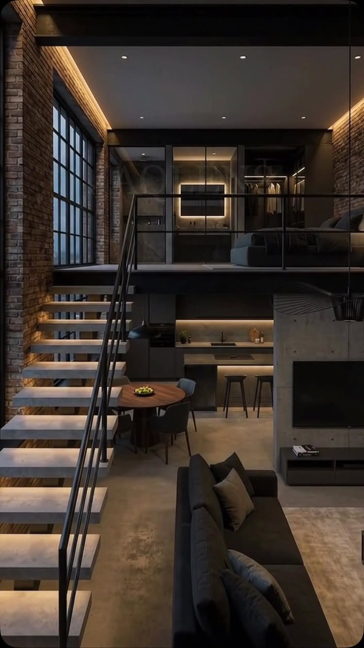
Exposed brick, a concrete floor and black metal stairs do the decorating in an industrial loft, which is why the furniture can stay quiet.
In an industrial room, a dark grey sofa matches the metal and concrete tones without competing with them.
Those materials are the architecture, so they’re hard to add to a rental. If you rent, borrow the look with black metal shelving or a dark sofa, and let the existing walls do whatever they can.
Keep the palette to grey, black and brick tones.
16. French Country
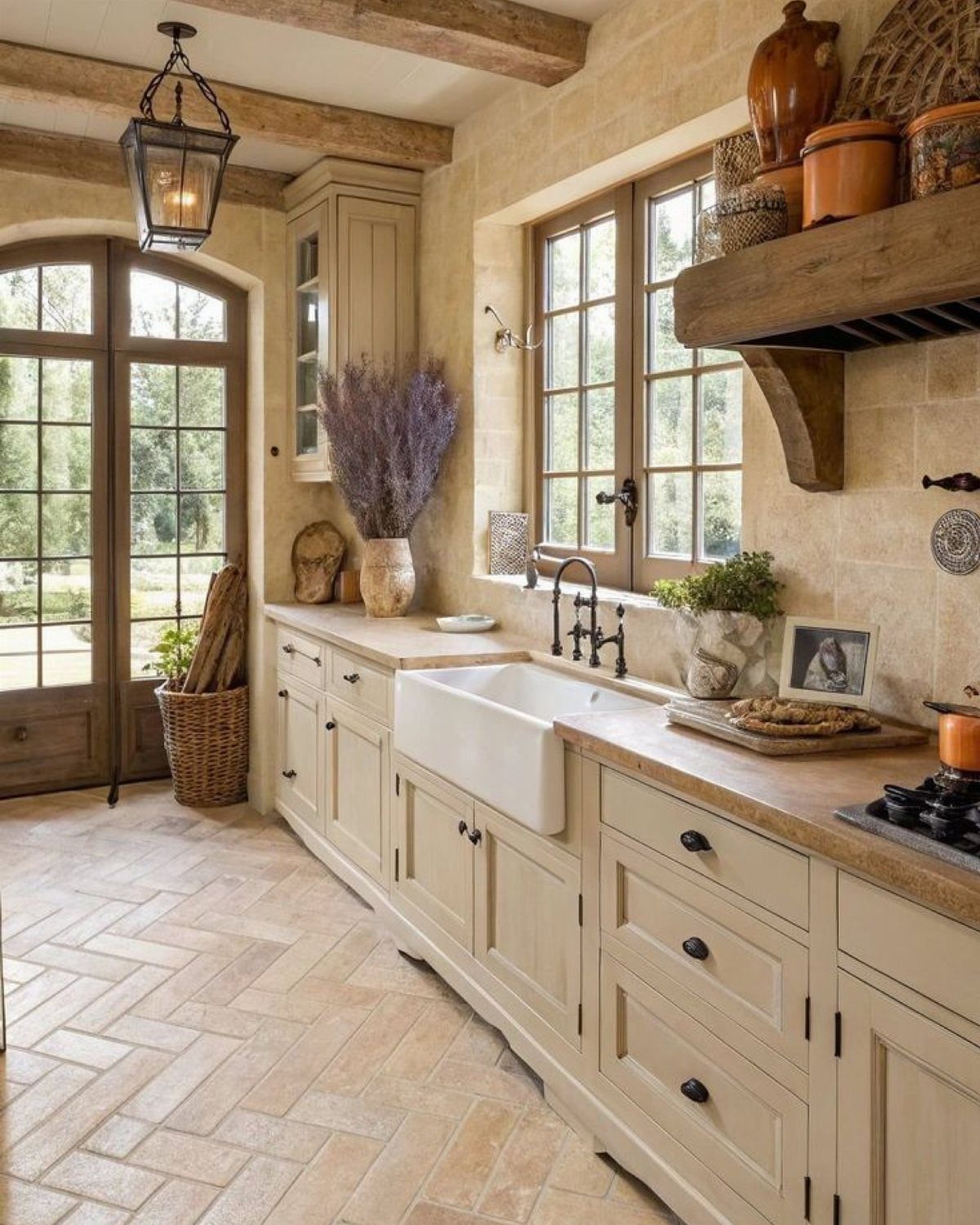
French Country runs on soft colors and old shapes, so cream cabinets and a deep farmhouse sink do most of the work, and stone walls or wood beams are a bonus if the house already has them.
Nothing in it looks new, and that’s the appeal.
Herringbone tile on the floor adds pattern without adding color, so the cream stays calm. With a big window, I’d skip heavy drapes, since daylight on cream and wood warms a room better than fabric does.
Painting cabinets cream is the most affordable piece of this look to copy. Beams and stone are structural, so they cost far more.
17. Glam Design
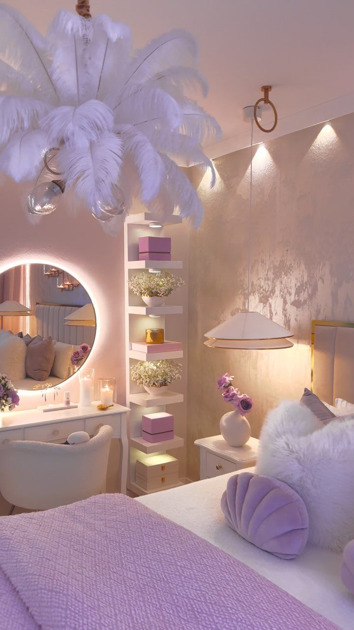
A feather chandelier is a glam move, and it works because it draws the eye straight up. Once one piece that dramatic hangs overhead, I’d keep the rest of the bedroom simple enough to support it.
Glam bedding works best in 2 swappable layers: a rich color like purple for the sheets and duvet, then white faux fur on top as a throw or pillow.
A backlit round mirror adds a glow that makes the room feel staged for evening.
Choose one showpiece, then repeat its color in smaller touches. 3 competing statements turn glamour into clutter.
18. Luxe Industrial
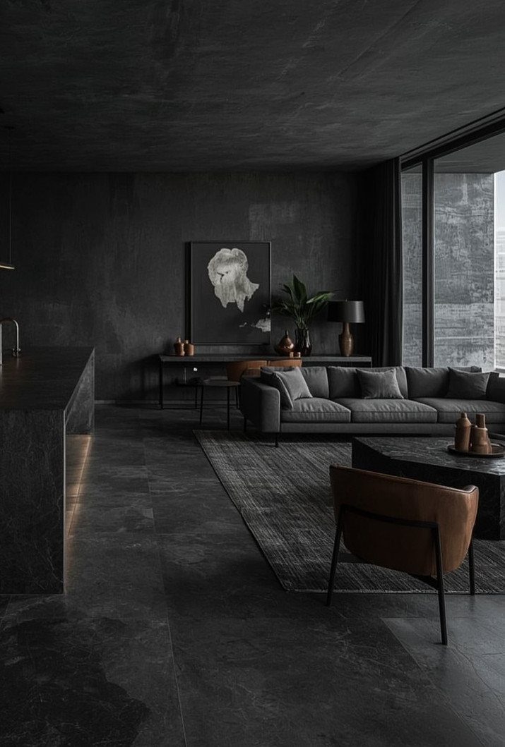
Luxe Industrial takes the raw shell of concrete walls and floors and softens it with better finishes.
A dark room like this needs little else.
Leather is the splurge I’d make. It improves the concrete instead of fighting it.
19. English Country
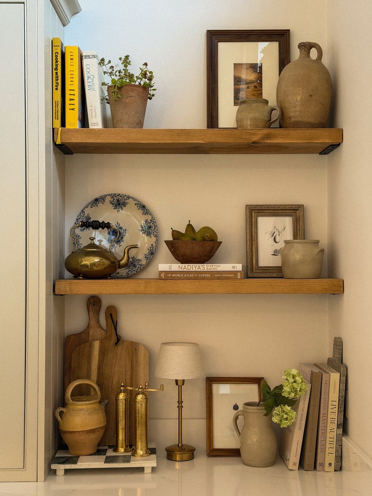
Floating shelves suit English Country because the style lives in what sits on them. Pottery, a brass teapot, a stack of cookbooks and a small lamp read as a collection built over years, and the wood keeps it warm.
Mix heights and leave a little bare shelf between groups so nothing looks crowded. A framed picture leaning among the objects does more than one hung alone.
Secondhand pottery and old books are the cheapest way to fill them, and buying slowly keeps the look from feeling bought in one trip.
20. Shabby Chic
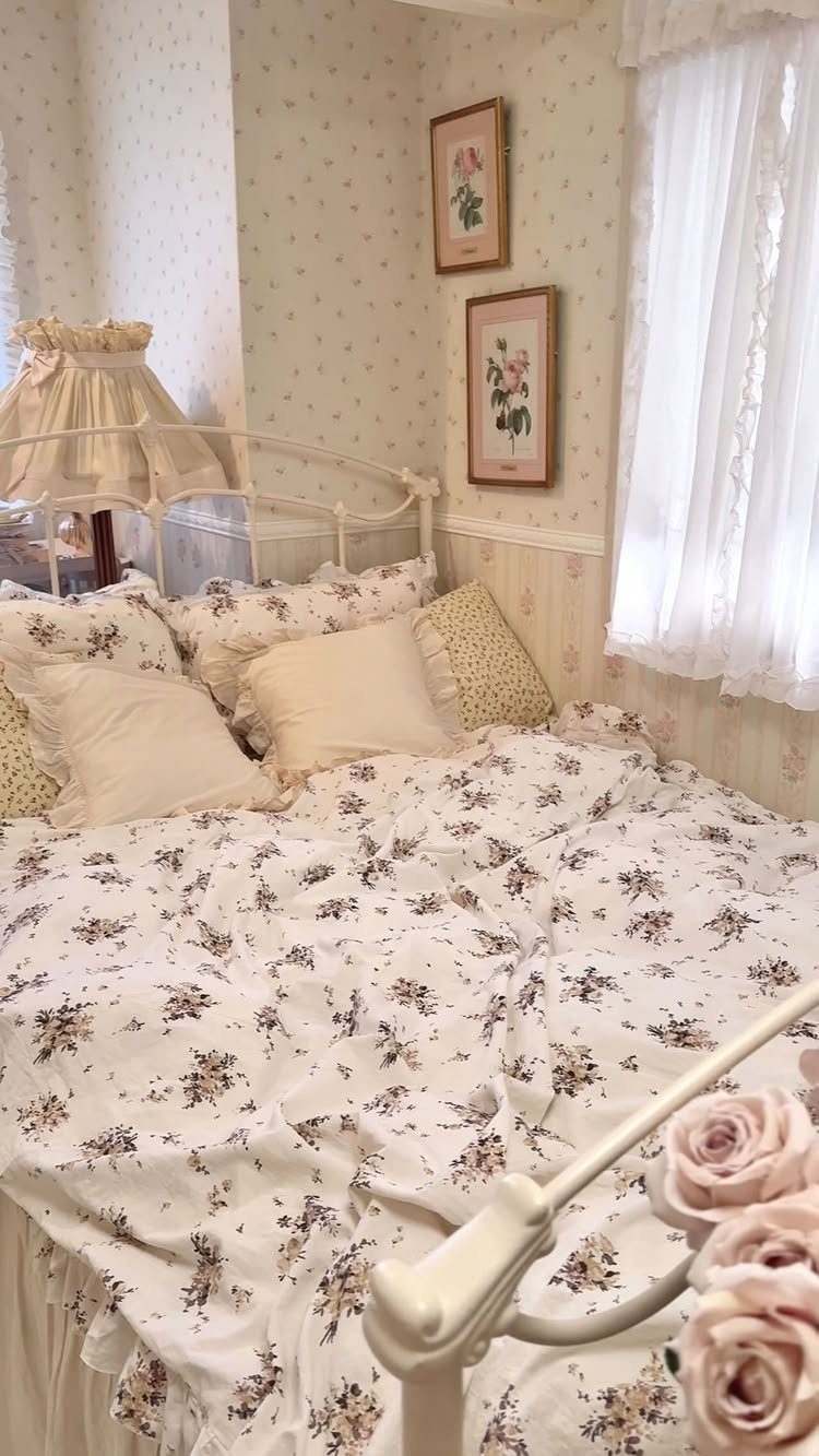
Shabby Chic comes down to soft, faded prettiness, and a white metal bed frame sets that tone before anything else is added.
Floral bedding against floral wallpaper only works when the flowers share a color range, so I’d keep both in the same gentle palette.
Hang two framed flower prints at matching height and add plain white curtains, and the room gets a quiet spot for the eye to settle. Lace is the lightest way to add age.
The furniture and decor pieces of a shabby chic room, like worn dressers, vintage mirrors, and slipcovered sofas, are the things you can buy and take with you.
Finding and Testing Your Aesthetic
Save images of rooms you’d happily live in, then lay them side by side instead of judging them one at a time.
Repeats tell you the most: the same colors, the same materials, similar furniture shapes, and a similar level of decoration, whether that’s bare surfaces or full shelves.
Boil the pattern down to 3 descriptive words, such as "warm, plain, textured," and pin them above a small mood board with a few images and a fabric swatch or two. If an image doesn’t fit the 3 words, take it off.
Then test the board against what you already own and how you spend your days. A pale rug looks lovely in a photo, but it may not suit a house where everyone walks in through the kitchen.
If you hire a designer or contractor, bring the board. Images settle disagreements about taste before anything is ordered.
Plan for Life and Function
Decide what the room has to do on a normal weekday before you pick anything for it. Who uses it, when, and what gets dropped, spilled or stored there?
Measure the room, the doorways and the path in from the entry, then tape furniture footprints on the floor.
Keep main walkways wide enough to move through without turning sideways, and watch any chair that narrows a doorway, because that annoyance returns every single day no matter how good the chair looks.
Check comfort in person when you can: seat height, depth, and whether the fabric wipes or washes clean. I’d price in storage too, because a room with nowhere to put things fills up fast.
Set the budget room by room, and leave some slack for the pieces you’ll find you missed. If a project touches walls, wiring or plumbing, look up local building codes first; renters should read the lease.
Avoid Rushed Trend-led Decorating
Paint is the cheapest thing to change, so it goes last. Choose upholstery, fabric and carpet first, since they cost more to replace than a gallon of paint, then pull the wall color from them.
Settle the layout first, then shop for furniture. A sofa ordered on a hunch is the purchase most likely to end up on a return list.
Copying a catalog room piece for piece rarely feels like yours, because it was built around someone else’s light, walls and habits. Borrow one idea from it and leave the rest.
Trend pieces are fine in small doses, but build the room on things you’d still like if the trend vanished tomorrow.
Slow down as the room nears the finish line, since the last few pieces are the ones most likely to be bought in a rush.
Live in it for a while, and let the gaps show you what you actually need before you buy.
Frequently Asked Questions
How do I make my house look aesthetic?
Pick one look and repeat it. Pin photos of rooms you’d want to come home to, and whatever colors, materials and furniture shapes keep repeating across them can be boiled down to 3 words, like "warm, plain, textured."
What is the difference between aesthetic and style in interior design?
Aesthetic describes the mood a room gives off, while a style is a named tradition with its own rules, like Art Deco or mid-century modern.
Some people stay close to a single style, and others borrow from several until the mix becomes their own aesthetic. Mixing works best when a color or a finish repeats, so the room still hangs together.
What are some examples of interior design aesthetics?
Industrial rooms use exposed brick, concrete and black metal in a palette of gray, black and brick tones. Coastal rooms stick to soft sand tones, pale blues and white, with rattan for texture.
Japandi blends Japanese restraint with Scandinavian warmth, and farmhouse leans on worn, solid wood with real patina. Maximalist rooms go the other way, layering patterns, art and collections.
How do I find my design aesthetic?
Print or pin 10–15 photos of rooms you’d like to live in and set them out together in one grid. Check what recurs across the set: colors, materials, furniture shapes, and whether the rooms are sparse or packed with decoration.
Then hold that pattern up against your actual belongings and habits, because a pale rug photographs well but struggles in a house where everyone comes in through the kitchen.
Does aesthetic design have to be minimalist?
No. Loud wallpaper, shelves of books and a few antiques give a room just as much of an aesthetic as bare white walls do.
Minimalism is one option, and an eclectic room works just as well as long as something repeats, like a frame finish or a color.
How can I make my room more aesthetic on a budget?
Start with what you already own: rearrange the furniture, edit down the accessories, and improve the lighting, since warm light keeps a neutral room from feeling flat.
Thrift stores and secondhand shops can fill most of a budget room, and a couple of shared colors across pillows, art and small objects will tie the finds together.
How does analyzing lifestyle contribute to creating a functional space?
Looking at how you really live shows what the room handles on an ordinary weekday: who’s in it, at what hour, and where things get dropped, spilled or stashed.
That shapes the furniture arrangement, the storage and the layout before you buy anything.
Measure the room and the doorways, then outline each piece of furniture on the floor with painter’s tape so you can see whether the main paths stay about 36 inches wide, enough to walk without turning sideways.
What is the significance of understanding my taste in interior design?
Knowing your taste shapes the room’s atmosphere, from the color scheme and textures to the layout.
It also helps a designer choose materials that fit your vision and your budget. A mood board handed to a designer or contractor gets taste questions answered up front, before any order goes in.