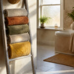

I’ve painted my grey-cabinet kitchen three times and learned from the mistakes.
White walls make them crisp and gallery-clean, while soft cream adds that morning-light glow I finally landed on.
Navy walls create dramatic contrast, like a movie set I once tried and my coffee maker seemed to approve of.
Blue-grey undertones in your cabinets pair well with warm taupes; cool greys work best with steely partners.
Texture solves the flat grey problem; grasscloth behind open shelves saved my kitchen from looking dull.
The undertone test determines success: tape swatches, watch them throughout the day, and let the light guide your choice.
Multiple pairings exist to transform your space.
How to Read Your Grey Cabinets’ Undertones Before Picking Wall Paint
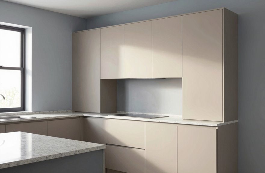
Why does picking wall paint for grey cabinets feel like solving a mystery with half the clues missing? I’ve been there, squinting at what I thought was “neutral” grey until it turned purple in my kitchen’s afternoon light.
Grey cabinets are chameleons, and their undertones, those sneaky blue, green, or yellow hints, determine everything. I learned this the hard way after buying three gallons of “perfect” beige that clashed spectacularly with my cool-grey lowers.
Grab paint swatches, lots of them. Tape them directly against your grey cabinets, then watch what happens in natural light throughout the day. That morning blue shift? The afternoon warmth? That’s your cool-warm balance talking.
Once you’ve cracked the code, finding complementary walls becomes almost easy. Cool greys love blue-based shades; warm greys crave taupe or cream. Your cabinet undertones will guide your wall color selection.
White Walls: The Classic Bright Backdrop for Grey Kitchen Cabinets

How do you make grey cabinets feel like they own the room instead of hiding in the shadows? Paint white walls, and suddenly everything breathes.
My first kitchen felt like a cave until I swapped beige for a bright backdrop. White walls reflect light, making grey cabinets pop whether they’re whisper-light or charcoal-bold. It’s like giving your kitchen a facelift without the weird bandages.
I recommend Alabaster for that creamy crispness, or Snowbound when you want pure, energetic chill. Both create a neutral foundation that lets you swap accent colors seasonally without repainting everything. My terracotta phase lasted three months, with no regrets.
| Element | Effect | My Tip |
|---|---|---|
| Natural light | Bounces, expands space | Skip heavy curtains |
| Dark grey cabinets | Gains drama, stays airy | Add brass hardware |
| Light grey cabinets | Blends softly, serene vibe | Try open shelving |
Build kitchens that welcome everyone. Start with white walls.
Soft Cream Walls: Warmth That Keeps Grey Kitchens Light

I’ve found soft cream walls completely transform how grey kitchens feel. They hit this sweet spot where everything stays bright and open while bringing actual warmth into the space, like sunshine through butter. Pair them with those softer grey cabinets and you’ve got this welcoming, lived-in glow that white walls simply cannot achieve.
Cozy Bright Balance
Soft cream walls are my go-to when I want that cozy bright balance that makes everyone feel instantly at home. I’ve seen soft cream walls transform grey cabinets from cold to welcoming, like wrapping your kitchen in a warm hug that still lets the sunshine bounce around.
Consider this palette in action:
- Morning light hitting cream walls, making your grey cabinets glow like they’re blushing
- A chunky knit throw on a bar stool, cream and grey coordinating together
- Coffee steaming on a counter that feels spacious, not cramped, because the brightness keeps everything open
Soft cream balances those cool grey undertones effectively. It’s versatile, inviting, and it works because the light reflectivity creates an airy feel while maintaining warmth, which is why this combination succeeds in residential spaces.
Warm Neutral Pairing
Against the cool slate of grey cabinets, soft cream walls hit that sweet spot I’m always chasing: warmth without the weight, like sunlight through honey. I’ve tried stark white and felt the chill. This warm neutral pairing creates an inviting space that feels open and welcoming.
Soft cream keeps that openness we crave and bounces light around effectively, even when your grey kitchen cabinets lean charcoal. In my own kitchen, I learned the limits of too much beige, which felt cave-like, and too much white, which felt sterile. Cream strikes the right balance.
The warmth plays nicely against softer greys; the combination feels balanced and intentional. Add brass pulls and a terracotta pot, and the space gains texture, depth, and visual interest. This combination creates a comfortable, livable kitchen that doesn’t feel static.
Light Gray Walls: Soft Sophistication for Modern Grey Cabinet Kitchens
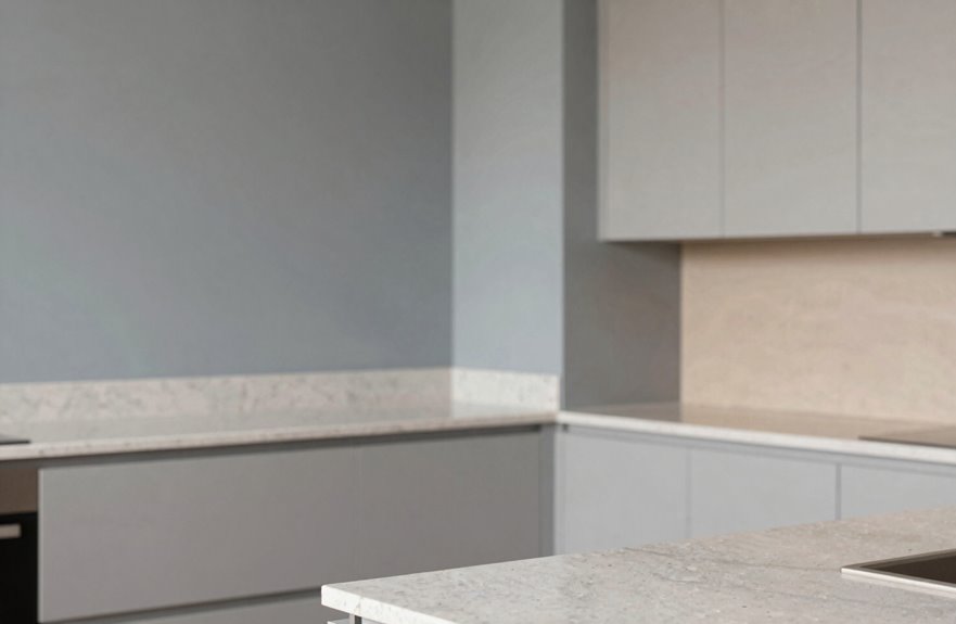
Light gray walls create a modern, monochromatic aesthetic with grey cabinets. The sleek combination works because of its understated design approach. However, tone variation is essential to avoid a flat, monotonous appearance.
Consider pairing pale silver walls with charcoal lower cabinets, or warm greige walls against cooler slate uppers. This contrast maintains visual dimension and interest while allowing for personal style choices.
Monochromatic Modern Appeal
When I’m designing a kitchen that feels both calming and put-together, I reach for light gray walls with light gray cabinets. This monochromatic scheme creates visual interest through layered depth rather than color variation. Cool-gray tones provide a modern backdrop that allows the eye to rest without visual competition.
- Matte cabinets against satin gray walls catch light differently, creating subtle textural contrast
- Brushed brass pulls gleam against that soft backdrop, adding metallic accents throughout
- Natural light bounces everywhere, making your kitchen feel twice its actual size
A monochromatic approach delivers a timeless aesthetic with lasting appeal.
Tone Variation Tips
Moving past the all-one-tone look, I’m obsessed with how light gray walls play against gray cabinets when you nail the shade difference just right. It’s like whispering instead of shouting. I learned this the hard way after painting my own kitchen walls the exact same gray as my cabinets and watching the whole room turn into a sad, flat blob. Now I prioritize tone variation.
Light gray walls create a serene, airy backdrop that makes gray cabinets sing without competing. Pale tones keep things warm rather than cold, especially in my tiny north-facing kitchen where every photon counts.
Go-to palette pairings:
| Gray Cabinet Shade | Perfect Light Gray Wall Pairing |
|---|---|
| Charcoal | Almost-white with cool undertones |
| Medium gray | Greige, warm and welcoming |
| Blue-gray | Soft silver with hint of warmth |
| Green-gray | Pale sage-gray, so fresh |
Accent colors pop against this combination. Brass hardware and walnut shelves complete the look.
Beige and Taupe Walls: Cozy Balance for Cool Grey Cabinets

Why does grey sometimes feel like that friend who’s brilliant but emotionally distant? I’ve been there, staring at my grey cabinets wondering where the heart went. That’s when I discovered beige walls and taupe walls as warm counterpoints for your kitchen.
Here’s what this cozy balance actually looks like in real life:
- Imagine creamy beige walls catching morning light, their warm undertones making your grey cabinets feel inviting, not icy
- Picture soft taupe walls with subtle brown notes, creating that neutral palette where everything just works
- Visualize terracotta pots and linen curtains popping against this backdrop, because beige and taupe play nice with practically every accent you love
Taupe walls work particularly well in dim breakfast nooks, transforming grey cabinets from showroom-like into livable spaces. This combination functions effectively in various kitchen settings and lighting conditions.
Grey-on-Grey Walls: How to Nail a Monochromatic Kitchen
I’m obsessed with getting grey-on-grey just right because I’ve definitely made it look like a “sad office” before, and nobody wants that. The trick is playing with shade variation: think of your cabinets, walls, and backsplash as a gradient story, maybe dove-grey cabinets against a slightly lighter “Skimming Stone” wall, so your eye keeps moving instead of hitting a flat wall of sameness. Then comes texture layering, which saves everything. Matte painted walls against satin-finish cabinets and a rough concrete tile backsplash create the tactile differences that prevent your kitchen from looking like a photograph instead of a functional, lived-in space.
Shade Variation Essentials
How do you make a grey kitchen feel alive instead of a sad concrete bunker? The answer lies in shade variation, playing with undertones like a DJ mixes tracks.
In a monochrome kitchen, cool grey cabinets paired with a wall color two shades lighter, both with blue-grey undertones, create depth. The room suddenly feels more expansive.
Here’s your blueprint:
- Contrast charcoal walls with pale grey cabinets, or flip it with dark cabinets and misty walls
- Match undertones: warm greige with warm grey, steely cool with cool grey
- Layer light values so shadows dance across surfaces without harsh color breaks
This approach is what separates successful grey-on-grey kitchens from ones that fall flat.
Texture Layering Techniques
Paint every surface the same flat grey and you’ve created a sensory deprivation chamber. Monochrome only works when you embrace texture, layering different finishes on grey kitchen walls to create depth that flat color cannot achieve.
Mix matte trim against satin feature walls, or use grasscloth behind open shelving for that linen-like warmth. Pair cooler dove greys with warmer greige undertones; your eye will catch the subtle shift. Brick-ledger panels, even on one plane, transform a space significantly.
Varying hues between walls, ceiling, and trim highlights cabinet profiles effectively. Matte metals, natural wood bowls, and nubby fabrics tie the scheme together without disrupting the overall mood. These layered textures create spaces that engage the senses rather than feel like empty warehouses.
Blue Walls: From Calming Sky to Dramatic Navy With Grey Cabinets
Why does blue feel like such a natural pairing for grey cabinets? This combination works consistently across different kitchen styles. Blue walls offer everything from calming morning-sky serenity to dramatic navy depth, and grey cabinets complement them seamlessly. I painted my own kitchen a soft, breezy blue once, and my light grey cabinets created an intentional contrast rather than an accidental one.
Blue and grey cabinets just work—whether you’re after morning-sky calm or cinematic navy drama, the pairing always feels intentional, never accidental.
- Pale blue walls paired with dark grey cabinets create a cozy, balanced aesthetic
- Navy walls make light grey cabinets stand out with sophisticated, cinematic appeal
- Mid-tone blues generate the balanced energy that makes a space feel welcoming
This pairing delivers both visual harmony and practical design flexibility for any kitchen.
Teal and Peach Walls: Fun Colors That Wake Up Grey Cabinets
Blue’s great and all, but sometimes I’m itching for something that doesn’t whisper, it sings. That’s where teal walls sweep in like that friend who actually gets you. I’ve seen teal walls with grey cabinets absolutely transform a kitchen, that contrast hitting like a perfect high note. Deep and dramatic against charcoal, or breezy and beachy with lighter greys, teal works as a contemporary choice without trying too hard. The vibrant backdrop makes those cabinets feel intentional, not accidental. And peach? It’s worth considering. It’s like wrapping your kitchen in a sunrise, that soft warmth against cool grey creating color pairings that feel both brave and totally livable. Balance is everything with these combinations. Metallic hardware, light counters, and the genuine surprise on guests’ faces when they see the finished result all work together. These hues create a welcoming home atmosphere.
Burgundy, Green, and Yellow Walls: Bold Accents That Pop Against Grey
Sometimes I catch myself playing it too safe. Grey cabinets deserve wall color that makes you feel something. Bold accents aren’t scary; they’re invitations to belong in your own kitchen.
Burgundy wraps around dark grey cabinets like a velvet hug, dramatic and unapologetic. Deep green brings the outside in, earthy and alive against medium tones. Bright yellow provides pure morning sunshine, energizing light grey without overwhelming the space.
Consider these combinations:
- A burgundy accent wall behind charcoal lowers, brass pulls catching that rich light
- Deep green surrounding slate grey, terracotta pots on the sill, herbs thriving
- Sunny yellow backing pale grey, white countertops keeping everything grounded
Balance with lighter surfaces and neutral trim. You’ll transform your kitchen from a purely functional space into a room that reflects your personality.
Navy and Charcoal Walls: Deep Tones That Ground Grey Cabinetry
How do you make grey cabinets feel like they own the room? Anchor them with deep tones that command attention.
Navy walls transform grey cabinetry into something from a design magazine: dramatic, luxurious, and striking. The grounding contrast between that rich blue and soft grey creates visual impact. Brass hardware, white marble counters, and breathing room complete the look.
Charcoal walls offer a different approach: more monochromatic, decidedly modern. Either option builds a moody kitchen that feels intentional and collected.
The essential technique involves lighter textures, glass accents, and ceramic details. Without these elements, the space feels heavy. With them, the room achieves proper balance and intentional design.
Black Walls: Maximum Drama With Dark Grey Kitchen Cabinets
The trick? Lighting balance, always. Without it, you’ll feel like you’re cooking in a cave, and nobody wants that. I learned the hard way; my first attempt was, well, let’s call it “cozy” and leave it there.
- Glossy subway tiles that catch pendant light like little mirrors
- Brushed brass metallic accents warming up all that darkness
- Velvet barstools and rough-hewn wood textures adding soul
Amp up textures everywhere, and your space will feel complete.
Should Your Walls Blend With or Stand Out From Grey Cabinets?
I’ve wrestled with this exact question in my own kitchen, and it’s the kind of decision that requires careful consideration. Blending your wall color with grey cabinets creates a calm, cohesive look. Think soft whites paired with light grey for a serene aesthetic. Wall contrast, however, offers visual interest and drama. Navy against grey cabinets provides depth, allowing your cabinets to serve as a neutral foundation. I made a mistake once by ignoring cool versus warm undertones, and my kitchen felt like an institutional space rather than a home.
Cool greys pair well with blues and blue-toned neutrals. Warm greys work better with beige and warm beiges. Space perception also plays a role in your decision. Light walls make spaces feel larger, while dark walls create an intimate atmosphere. Choose the approach that aligns with both your aesthetic preferences and how you want the space to function.
Wallpaper and Textured Walls: Pattern Options for Grey Cabinet Kitchens
Why settle for flat, forgettable walls when you could wrap your kitchen in something visually striking. Grey cabinets benefit from complementary textures and patterns that add depth.
Grasscloth wallpaper transforms spaces effectively by adding a woven texture that catches light throughout the day. Your pattern options are extensive, offering flexibility in your design approach:
- Classic red toile for cozy, farmhouse warmth against cool grey cabinets
- Vintage Italian tile prints that transport you straight to a sun-drenched villa
- Geometric designs creating rhythm without stealing the spotlight
This textured backdrop creates balance in your kitchen. Light grey cabinets contrast effectively against darker grasscloth, while deep charcoal units stand out against lighter textures. Once you have a dimensional wall with texture, flat paint becomes noticeably less appealing by comparison.