
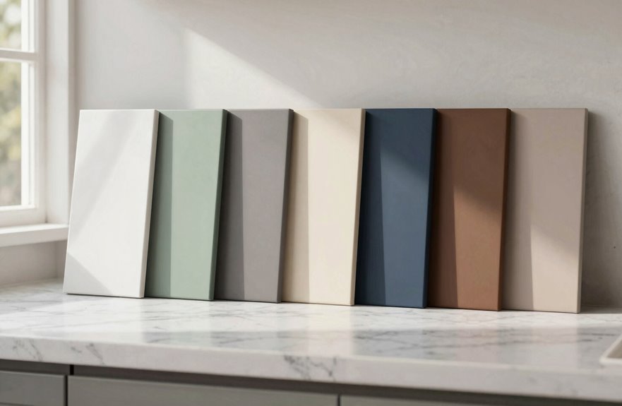
After painting my own cabinets three times, I’m convinced 2027’s palette finally gets it right. Warmth beats sterile every time. I’m seeing warm greige replace those rental-showroom whites, cream linen that won’t embarrass you by 2029, and mushroom taupe giving that cozy “emotional hug” without heaviness. Sage green brings nature indoors, charcoal black stays dramatic without suffocating with airy uppers, walnut brown celebrates real grain again, and pale bleached oak captures that Scandinavian sunlight vibe. For the brave, three-color blocking (navy island, soft white perimeter, brass shelves) makes guests assume you hired a designer. Each shade honors actual living, not Pinterest fantasy you’ll hate in six months, and I’ve broken down exactly where each one shines.
The 7 Best Kitchen Cabinet Colors for 2027 (And Where to Use Each)
Wondering what’ll make your kitchen feel fresh five years from now? I’ve spent months poring over designer portfolios, and we’re ditching boring beige together.
We’re ditching boring beige together—designers are already living in 2029, and your kitchen should too.
Two-tone cabinets are absolutely everywhere I’m looking, and they make a compelling case for renovation. Picture this: warm mushroom uppers that feel like your favorite latte, paired with deep navy bases that ground the whole space.
Natural walnut grain against sage green islands is a combination designer friends frequently choose. Charcoal accents add moodiness without heaviness, creating that perfect rainy Sunday feeling.
Brushed brass hardware pops against these palettes, creating kitchens that feel collected rather than decorated. Your eclectic mix of vintage finds belongs in this style.
Warm Greige Cabinets: The Neutral That Replaces Cold White
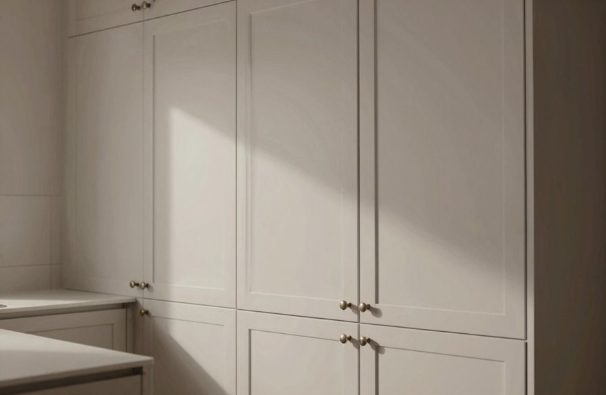
I’m obsessed with how warm greige cabinets completely rescue kitchens from that sterile, dentist-office vibe we’ve all suffered through. By blending white with mushroom and taupe, think of that perfect latte color that somehow matches everything you own, this neutral wraps the room in something that actually feels like people live there. I’ve seen it work magic with brushed brass hardware catching morning light, or matte black pulls for that moody contrast, and it plays so nicely with natural wood tones and those soft, muted greens everyone’s pinning right now that you’ll wonder why you ever stressed about going neutral.
Why Greige Wins
Because I’ve spent years staring at kitchens that felt more like hospital corridors than heart-of-the-home spaces, greige is the color rescue we’ve been waiting for. This warm, whisper-soft blend transforms sterile rooms into spaces where you actually want to linger over coffee.
Greige gives us that cozy glow we crave without sacrificing the clean, contemporary lines we love. It plays beautifully with brushed brass pulls, that little flash of warmth, or matte black knobs for some edge. Whether you’re drawn to classic overlay doors, precise inset styles, or sleek frameless designs, greige works with every option.
It anchors bold two-tone schemes without demanding attention. Greige simply belongs in a space. The result is a kitchen that feels lived-in, loved, and authentically yours.
Styling Warm Neutrals
I’ve watched warm greige sweep through kitchen after kitchen like that first perfect sip of coffee on a Saturday morning. These are familiar colors, yet somehow better than you remembered. These warm neutrals aren’t just a trend; they’re your invitation to finally feel at home in your own space.
I pair mine with brushed brass pulls that catch morning light, or matte black for drama that still whispers rather than shouts. White isn’t dead, friends. It’s just softened with mushroom and linen tones that hug you back. Whether you’re into overlay, inset, or frameless, this “perfectly brewed coffee” palette works everywhere. It adds depth without heaviness, character without chaos. Warm neutrals deliver that universal appeal we’re all craving right now.
Cream Linen Cabinets: Soft Warmth That Outlasts Trends
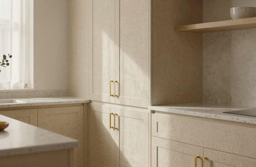
Why do some kitchens still feel dated after five years while others settle in like they’ve always belonged there? Cream linen is the answer.
This finish gives you that soft warmth you’re craving without demanding attention. It’s like the perfect guest at your dinner party; charming, adaptable, never overwhelming.
Consider these advantages:
- Pairs beautifully with brushed brass or matte black hardware (both options work equally well)
- Works across every style: overlay, inset, frameless. Cream linen belongs in any cabinet configuration.
- Color-blocking magic: light perimeters with a warmer island creates that designer contrast effect.
Cream linen honors natural grain while keeping spaces airy. There’s no heaviness, no anxiety about following fleeting trends. What remains is the quiet confidence of a kitchen that functions as a home without requiring periodic updates.
Mushroom Taupe Cabinets: Warmth Without the Weight
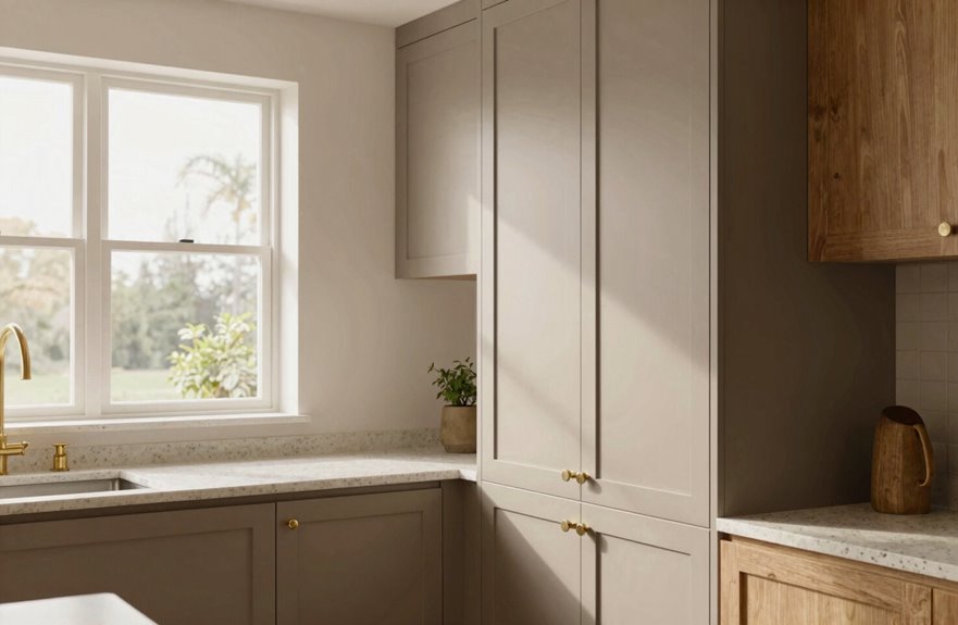
Mushroom taupe hits that sweet spot where your kitchen feels cozy without visual weight. I learned this the hard way after painting my own cabinets too dark and spending two years feeling like I cooked in a cave. Never again. This shade pairs well with brushed brass knobs that catch morning light, or matte black pulls if you prefer an edgier aesthetic. The color allows wood grain to stand out without demanding attention.
Color Psychology Benefits
When I first walked into a kitchen clad in mushroom taupe, I stopped mid-step. There was this instant exhale, like the room itself was giving me a hug without smothering me. This color works psychological magic.
Warm neutrals like mushroom taupe ground us emotionally. They whisper “you belong here” instead of shouting for attention. What I’ve noticed:
- They reduce visual stress, your brain doesn’t work overtime processing bold saturation
- They create emotional safety, like that perfect oversized sweater you steal from your partner
- They adapt to your mood, feeling cozy in winter mornings and quietly refreshing during summer chaos
I’d pick mushroom taupe for how it makes me feel coming home.
Pairing Possibilities Explored
That hug-in-a-color feeling from mushroom taupe is real. I’ve stood in my kitchen just soaking it in. These warm neutrals deliver that perfectly brewed coffee vibe, soft and sophisticated, never bitter.
I’ve paired mine with brushed brass pulls that catch morning light like little winks, and the combo feels expensive without trying too hard. Matte black works too if you prefer a moodier aesthetic. Warm neutrals play nice across every style: overlay, inset, frameless, whatever you’ve got cooking. The shift away from sterile white kitchens is refreshing. My friend went frameless mushroom taupe last month and texted me with genuine enthusiasm about the transformation. You’ll find this works in your space.
Sage Green Cabinets: Nature’s Calm for Islands and Perimeters

Why does sage green feel like that first deep breath after stepping onto a porch in early spring? I can’t explain it, but I know you’ve felt it too; that instant calm, that “I’m home” sigh. That’s exactly what sage green cabinets bring to your kitchen.
I’ve seen this “new neutral” transform islands into grounding centerpieces while lighter perimeters float around them. It’s nature-inspired without screaming “trendy.” The color-blocking strategy, sage on the island and cream everywhere else, creates this gorgeous visual rhythm that doesn’t overwhelm.
Here’s how I make it work:
- Pair sage with brass hardware for warmth that feels collected over time
- Balance darker base cabinets with sage uppers to keep things airy
- Use matte black pulls when you want that modern-farmhouse edge
This approach delivers timeless results.
Navy Blue Cabinets: Bold Enough to Stand Out, Neutral Enough to Live With
Sage green whispers, but navy cabinets command attention through style. I’ve seen friends hesitate about “too dark,” then embrace a navy island anchoring white uppers, with brass hardware catching morning light. Suddenly they’re the hosts everyone gathers around.
Navy is that rare choice that pairs well with other elements. Warm woods complement it naturally. Brass pulls work beautifully. I once paired navy base cabinets with lighter uppers in a color-blocked scheme, and the depth and contrast gave the kitchen a distinctive personality.
Designers emphasize strategic placement for good reason. A navy island provides a strong focal point without reducing brightness around the perimeter. It delivers visual impact while remaining versatile enough to adapt as your style evolves.
Charcoal Black Cabinets: Drama Without the Cave-Like Feel
How do you get the moody drama of black without your kitchen feeling like a dungeon? The answer lies in a few strategic choices.
Charcoal black cabinets hit that sweet spot: deep and dramatic, but never suffocating. After painting my own kitchen too dark initially, I discovered what actually works. Matte finishes soften everything, and pairing charcoal lowers with airy white uppers keeps things breathable. Add brass hardware, maybe some glass-front accents, and suddenly you’ve got warmth, reflection, and serious sophistication.
Here’s how to nail it:
- Mix your tones – charcoal island, light perimeter, instant depth.
- Choose warm hardware – brass or matte black, nothing cold or clinical.
- Add reflective moments – glass, metallics, anything that catches light.
This approach delivers the magazine-worthy aesthetic without the cave-like atmosphere.
Walnut Brown Cabinets: Wood Grain Color Returns to Center Stage
Where did all the real wood go? I’ve missed it, and I’m betting you have too. Walnut brown cabinets are back, and they’re bringing that gorgeous grain with them. The streaks and swirls catch morning light, each one telling its own little story.
I recently ran my palm across a Showplace sample, and that warmth is distinctive. It’s craftsmanship you can feel, rooted in Midwest honesty. I’m seeing designers get clever now, pairing walnut with crisp painted uppers for two-tone magic. Stained, not painted solid; that’s the secret. You keep that tactile, authentic look.
| Walnut Pairing | Mood It Creates | Perfect For |
|---|---|---|
| Soft sage green | Earthy, grounded | Cottage kitchens |
| Crisp white | Clean contrast | Urban lofts |
| Matte black hardware | Modern edge | Transitional spaces |
| Brass accents | Warm luxury | Eclectic homes |
Color-blocking with wood brings dimension and visual interest to kitchen design.
Pale Bleached Oak Cabinets: Scandinavian Light for Modern Kitchens
Scandinavian design strips away the fuss, and pale bleached oak cabinets nail that vibe. Think sun-bleached driftwood, not sterile white boxes. The light wood appeal works when you see those soft, almost-whitewashed grains catching morning light, warming up your space without weighing it down like darker woods can. Pale oak cabinets can read too “beachy rental” without the right pairing, but add brass pulls and a sage backsplash, and your kitchen becomes bright and modern. The combination creates an airy aesthetic that feels intentional rather than heavy.
Scandinavian Design Roots
Why does Scandinavian design still feel so fresh, even after all these years? Bleached oak captures that effortless, light-breathing quality many seek. That barely-there stain lets the grain show through, like sunlight filtered through birch forests.
Here’s what makes this approach sing:
- Pair bleached oak with flat-panel doors and barely-there hardware for that authentic Nordic calm
- Layer it against crisp white cabinets, maybe brass pulls, creating tension without chaos
- Use it as your anchor for two-tone schemes, open shelving, whatever your heart wants
This finish embraces warmer neutrals without going yellow. That balance appeals to anyone seeking timelessness without stuffiness. Bleached oak works across a range of aesthetic preferences and design goals.
Light Wood Appeal
If I used to think light wood cabinets were what your grandma settled for when she couldn’t decide on a real color, I was wrong, and my own kitchen proved it. Bleached oak changed everything for me. It’s this gorgeous pale wash that keeps the grain alive, like Scandinavian sunlight trapped in timber, and suddenly my cramped galley felt like a Copenhagen loft.
Bleached oak plays nice with literally everything. White perimeter cabinets work with it. A moody navy island works absolutely. I paired mine with brushed brass pulls, and the warmth complements the look. Matte black works too if you’re feeling edgier. For 2027, this finish hits that sweet spot, softer than gray and totally timeless. It creates a sense of intentional design, even in spaces that aren’t perfectly curated.
Modern Space Brightening
So where does bleached oak actually shine? I’ve seen pale bleached oak cabinets transform cramped galley kitchens into sun-drenched sanctuaries. That Scandinavian light trick is not just bright; it’s alive, whispering warmth through every grain like morning through linen curtains.
Here’s what I’ve learned from my own reno disasters (yes, plural):
- Pair with warm brass hardware, not chrome. Chrome creates a dated aesthetic that conflicts with the wood’s warmth.
- Keep walls soft neutral, think oatmeal not eggshell, so the wood sings.
- Splurge on low-VOC finishes, because standard finishes allow yellowing oak to lose its luminosity over time.
We’re chasing that open-plan magic, right? Lighter wood tones beat stark white because they reflect natural light while maintaining visual warmth. They breathe, they invite you in. It’s brightness with soul, texture with welcome. Bleached oak cabinets create a functional foundation for any modern kitchen that needs more natural light and spatial openness.
Three-Color Kitchen Cabinets: How Color Blocking Works in 2027
Where do we even go after two-tone cabinets have taken over every kitchen on my Pinterest feed? Three-color cabinets offer the next evolution in kitchen design.
Two-tone cabinets dominated every Pinterest feed—until three-color kitchens emerged as design’s bold next chapter.
I pair my navy island, which provides bold grounding, with soft white perimeter cabinets, then incorporate brass-accented open shelving as my third zone. Three distinct areas, clean boundaries, and instant depth result from this approach.
The key step is using photo-realistic renderings first. Committing to three finishes without previewing can lead to costly mistakes.
I’m leaning into warm neutrals, sage greens, and natural wood tones; colors that complement each other. This approach creates intentional color-blocking that gives my kitchen actual personality instead of appearing chaotic.
Three-color blocking works when the finishes are coordinated and the spatial zones are clearly defined.